
Fantastic Image Formats and Where to Use Them
Picture the scene, you’ve just created an amazing design that you are proud of. Every single pixel has been rigorously checked and now it is time to share your genius creation with the world. But there is just one last hurdle to jump – get this wrong and it could prove to be costly!
In this article, we will explore all of the amazing image formats there are, helping you to navigate the maze and prevent you from falling into any hidden formatting traps, as well as offering hints and tips to help you find the perfect fit.
PNG vs JPEG
Before you embark on any design project the first thing that you need to identify is what is its purpose? This will ultimately decide how you are going to save the file.
Each format has its own benefits, and as a piece of communication, the format acts as the technical backup that your file needs.
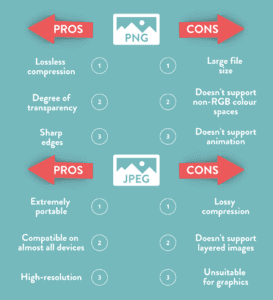
PNG
Let’s start with Portable Network Graphics, aka PNG files. The format was designed to be used on raster graphics, screenshots and on logos. Because of this, the file size is large – a lot more so than JPEGs.
As a result of being so large, a PNG file supports lost compression. This means that it is extremely versatile, looking sharp and clear on a wide range of different ratios, from large main website images to thumbnails.
Providing great depth in colour ratios, PNG is especially useful when your design has areas of transparency. The alpha channel that the format uses will allow you to have partial to full transparency, which makes it useful for creating fades.
JPEG
On the other hand, you don’t get as much versatility with JPEGs as you do with PNG’s. When you compress JPEGs this will alter the quality of the image or design. The file size is also a lot smaller, and because of this, you are unable to have transparency.
Despite its limitations, JPEG does have some benefits. It is the most common graphic format for photographs as it is able to display the same level of detail as a PNG at a fraction of the file size.
Due to being such a small file, this can also benefit when used on websites, as it will keep loading times low to improve someone’s experience on them.
Any Other Formats
When you hear the word GIF you immediately think of looping jolty videos of cats falling off tables. But they are also an effective and surprisingly easy format to create interactive designs.
A Graphics Interchange Format, aka GIF, supports multi-page formats, as well as transparency. This means that you can use the format as a more interesting way of displaying information.
You can use it to deliver messages in multiple parts, display different products a company sells with their prices and even create your own animations on it. This simple yet effective format can be a lot more powerful than just a still design.
Another format that is extremely useful when creating designs – especially on logos and text graphics is a Scalable Vector Graphic, aka SVG.
This is because an SVG is an image that can be searched, indexed, scripted and compressed. Most importantly it can be scaled in size without losing any quality.
Because of this, it is always useful to have a library full of SVGs that you repeatedly use in designs. This means that no matter what the file size of the design is, the SVG will always look crisp and not distorted.
Image Sizing Matters
The size of an image or design affects a lot of areas, some of which you might not be aware of.
Images that are optimised for the web generally fare a lot better than those that aren’t. There are three main reasons for this:
- They look good on the page.
- They load a lot quicker than those that aren’t optimized.
- They are easier for search engines to index – resulting in stronger SEO.
And it is really simple how to optimize an image for a website – ensure that the sizing of it is web-friendly.
The higher the resolution of an image, the larger the file will be. If you were to print off this image it would be recommended to go higher with the resolution.
However, on the web, it is a different story as this will slow the web page down significantly. This hurts user experience on both desktops and mobiles.
But just how do you strike the right balance between size and quality?
Let’s start with how much a file actually takes up. The more bytes that a file has the more likely it is to slow down a website. Images that are over 5MB are quite large files, whereas anything displayed in KB is more reasonable.
There are different causes for large files. This could be because the image dimensions are too large, the resolution is too high or because of the complexity of the design or image.
One quick and easy fix is to just make sure that your dimensions are not too big. The typical image on a website is 795×300 pixels, which might not seem too much, but you are still able to get the detail needed to communicate.
And when it comes to the resolution, this is measured in dots per inch. Printers sometimes require images to be printed in 300dpi, but this level isn’t required in computer monitors. Most of them are set at 72dpi or 92dpi, which means that anything larger than that is unnecessarily large, without being beneficial.
Most editing software has shortcuts that can help you bypass this. When saving a post, there is a save for web option, and this automatically saves an image at a lower dpi.
One final tip for when uploading an image to a CMS is to always name it something appropriate. A Google index crawler is more likely to understand an image with an appropriate name to what it is than to one with a default name, usually one that consists of numbers and random letters.
Getting the Right Dimensions
Social Media
With this information on how to save an image for the web that is optimized, you can now explore other ways to get creative with the design.
The dimensions of a design will always be influenced by its purpose and destination.
When posting a design on social media, especially on Instagram it is worth noting how it will appear on a phone screen. Instagram itself has a preset square template, so by ensuring that your dimensions are equal, the design will fill them perfectly.
Instagram compresses an image to 600 x 600, but if you save your design as a PNG that is 1080 x 1080 your design will look flawless without any resolution being affected.
This is similar for other social media platforms, but the key thing to remember is that despite compressing your designs, the finished product will still look detailed. This will mean that any resolution around 1000x will look sharp and attractive.
Banners for Ads
Banners come in all different shapes and sizes. Because of this, they all have their own advantages in how you can communicate with them.
Some banners will allow you to pack it full of interesting images, design and copy, whereas some have less space, but can equally be as memorable and punchy.
With Google Ads, there is a range of common dimensions used that can fit into one of four categories:
- Squares
- Rectangles
- Skyscrapers
- Leaderboard
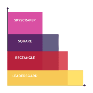
The most commonly used square size is 250 x 250, but you can also use a small square, which is 200 x 200.
With rectangles, there is a similar variation in that the most common is 336 x 280, but you can also have smaller ones, with 300 x 250 another size that is regularly used.
The benefit of using squares and rectangles is that you will find that there is a lot more space to express design. The shape of the surface area allows you to use different features and stylistic techniques.
Alternatively, skyscrapers and leaderboards are slightly different, as they have a more stretched surface area.
Named after their resemblance to the city skyline, the most common skyscraper is 120 x 600. Leaderboards are the opposite, they are wider than they are tall, with 728 x 90 being a go-to size.
Due to its shape, leaderboard designs are much more compatible with copy, as you will be able to fit a sentence naturally. This would be harder to do with a skyscraper, but equally as effective and you can clearly put all the important information in divided sections.
In terms of the actual design, it is worth noting that because of the size the image is going to appear at, the text has to be large and clear. Short, snappy straplines and keywords are important here as you are trying to grab people’s attention. By accompanying this with a call to action button, the headline keyword will act as a hook for the audience to “Find Out More”.
One final thing that is worth noting is that Google is extremely good at compressing image files without a decrease in the quality of resolution.
This means that you will be able to create your templates in a larger size to improve resolution, as long as they can be compressed into the file size requirements.
For example, a square template with a Google Ad size of 250 x 250 can be designed at 500 x 500, 1000 x 1000 or even 2000 x 2000. By saving as a PNG, this will mean you will have the same glossy design.
Conclusions
So what have we learnt from this scratching of the surface into the complex world of design? First of all, it is a minefield. But it is one that we can stop and think about before we set.
Every design format has a purpose, and you should observe these to tailor your design to its overall purpose.
The simple steps and considerations that you have to take might not seem like much, but the result of them will be incredibly effective.


