
Whether you are just starting your business out, or are an established name in your field, the logo is the first thing that you want the world to see and understand about your company. As a result of this, you want it to grab attention, make a strong impression and form the foundations of your brand identity.
Creating a new logo is not just something you can quickly knock together in a matter of hours. A wide range of factors will influence your decisions, helping to steer your creative vision.
1. Understanding the Brand.
Before you even open up your design software, it is important to lay the groundwork in the form of base company research. Whether you are acting on behalf of a client for a company you are not so familiar with, or as part of an internal design team, you need to understand the company from top to bottom.
To build a bigger picture, ask these questions and answer them in as much detail as possible:
- What do you do?
- Why do you do it?
- What makes you different from your competitors?
- What are your values?
Another way to understand your business is to identify your customer base. Create a mood board, creating a comprehensive understanding of who your customers are. What other sort of brands would they be loyal to? What are the visuals and designs that they are attracted to?
Although this won’t magically solve what your logo will look like, it will help you understand what you are trying to achieve, and also importantly, what sort of designs you would be trying to avoid.
2. Research the Field
Naturally, when you start to create your logo, you want to stand out from the crowd. This shouldn’t stop you from checking out what the competitors are doing with their logos, branding and identity.
For example, if you are tasked with creating a new brand for a barbershop in Leeds, create a logo board displaying logos side by side.
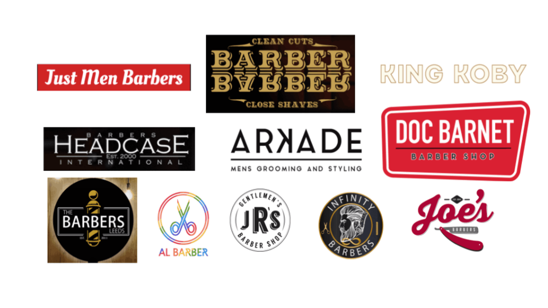
Having a range of logos on a sheet will help you to notice similarities and differences in the way that brands use text, font, colour and icons, as well as noticing certain layouts.
From a design perspective, you can then draw inspiration from the ones that you think work well, whilst also informing you on what to avoid.
It is worth remembering that the idea isn’t to reinvent the wheel. Most ideas have been tried and tested before, so there are rules and conventions in every industry that can be followed.
3. The Design Considerations
After researching your competitors, as well as getting a good understanding of the company whose logo you are creating you will be at a stage where it is finally time to start your design.
Every designer has their own process. Whether that be picking up a pencil and sketching some conceptual ideas or diving straight in, whatever works best for you.
Within this though, there are certain considerations and factors to observe.
- Typography
One of the most important ways to set the tone for the logo is through the font and typography. Is the font used appropriate for the logo? From your research on other competition, you would be able to see exactly what styles similar businesses go for, whilst also seeing what would be wildly inappropriate.
![]()
Can you combine typography with icons? Some of the best logos are layered in a way that have icons embedded within them that have a meaning or are they of significance. This is something you can get creative with. Does your company have any objects that are synonymous with the service? For example, could a hair salon use any letters to create a pair of scissors?
- Colour
You may have set company colours that you are planning to use for your logo already, but it is worth thinking a little bit about this before you make your final decision.
To understand what colours might be best used together, you can use the colour wheel to help inform your decision-making process.
Marketers use techniques to create colour harmonies by simply referring to the colour wheel.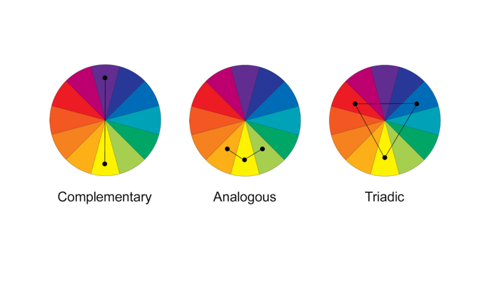
Colours at the opposite end of the wheel will naturally complement each other, but other relationships like Analogous colours, where they sit next to each other on the wheel can also be used to create pleasing harmonies.
Using the image above, try out the different techniques on your own design.
4. The Social Media Test
You have got to the stage where you are fairly comfortable that you are pleased with the logo. The design is pleasing, there is the right level of text and iconography on there and you can’t wait to show it off to the world.
However, there is one more consideration to take. How will it look on social media profiles?
When someone is scrolling through Twitter or Facebook on a mobile screen, they are only going to see a tiny logo in the corner of the screen.
Is this going to be instantly recognisable and memorable? This can be done through using the colours wisely, a hierarchy of elements on the logo so something stands out, or by the layout or shape of it.
A good way to think of it is how would it look as a widget for an app? If you can create an icon or letter that is instantly recognisable, like the Facebook app logo, when seen repeatedly the consumer will know instantly what the logo stands for.


