
by Robin | Mar 1, 2024 | Design and Branding

As a designer, navigating the vast landscape of typefaces can often feel like searching for a needle in a haystack. However, amidst the sea of options, one typeface stands out as a beacon of elegance and versatility: Hurme or to give it its full title Hurme Geometric Sans. For me, Hurme isn’t just a typeface; it’s a design companion that effortlessly elevates every project it touches.
What draws me to Hurme is its seamless blend of simplicity and sophistication. Designed in Helsinki by Finnish typographer Toni Hurme, this contemporary sans-serif typeface exudes a sense of modernity while retaining timeless appeal. Its clean lines and balanced proportions lend a sense of harmony to any composition, making it a go-to choice for a wide range of design applications.
I’ve lost count of the number of projects, here at Brand Ambition, that have started or finished with this typeface. I will often change the font in a project as it progresses but Hurme always gives me a great starting point.
For the purposes of type classification, sans-serif designs can be divided into four major groups: Grotesque (eg Akzidenz, Franklin Gothic etc) Transitional (eg Helvetica, Univers etc) Humanist (eg Calibri, Gill sans, Frutiger etc) and Geometric (eg Futura, Gotham etc).
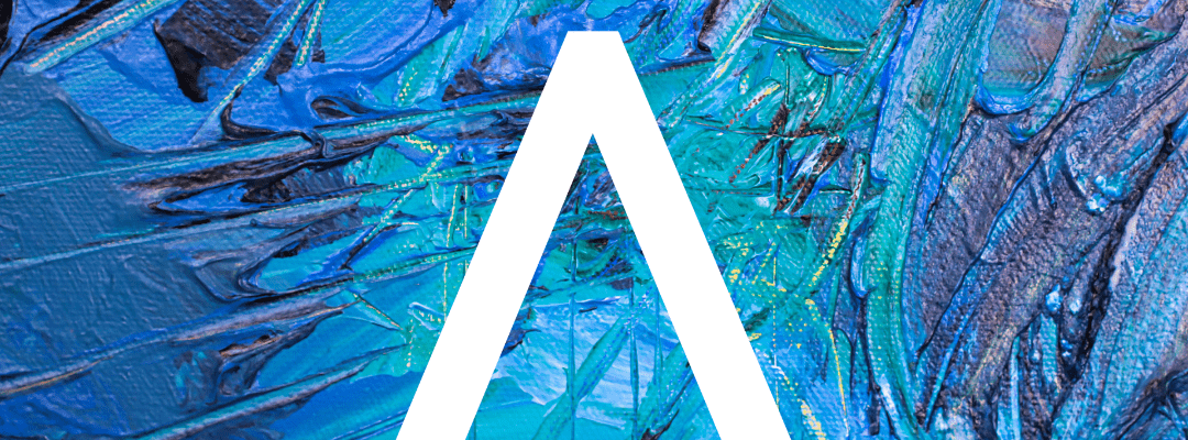
Hurme is is a Geometric sans serif font. As their name suggests, Geometric sans-serif typefaces are based on geometric shapes, like near-perfect circles and squares. Note the optically circular letter “O” and the simple construction of the lowercase letter “a”. Geometric sans-serif fonts have a very modern look and feel.

One of the most remarkable qualities of Hurme is its versatility. Whether I’m working on editorial layouts, branding projects, or digital media, Hurme adapts effortlessly to the task at hand. Its extensive character set includes various weights and styles, from sleek and minimalist to bold and authoritative, allowing me to achieve the perfect balance of form and function in my designs.
Hurme Geometric Sans includes seven weights with true SmallCaps and obliques. Alternate characters and other Opentype features make for a versatile family that can be adjusted for specific needs.

But Hurme isn’t just about aesthetics; it’s also about functionality. Its open counters and generous spacing ensure excellent readability, even at small sizes, while its modern aesthetic adds a touch of sophistication to every project. Whether I’m setting body text or crafting eye-catching headlines, Hurme never lets me down.
Beyond its visual appeal and technical prowess, Hurme is my “go to” typeface because of the sense of confidence it instills in me as a designer.
Hurme isn’t just a typeface; it’s a design philosophy. Its timeless elegance, versatility, and functionality make it the perfect choice for designers who strive to create impactful and memorable work. For me, Hurme isn’t just my favourite typeface; it’s an essential tool in my creative arsenal.

by Robin | Feb 12, 2024 | Design and Branding
Fonts. There are so many in every style imaginable, and they can leave a strong impression on people.
Typography (the art of arranging letters and text in a way that makes the copy legible, clear, and visually appealing to the reader) is more than an accompaniment to your brand.
It can be your brand.
But there are thousands of fonts available online, and many have pre-conceived connotations attached to them.
So, how do you choose the right one for your brand?
When building a brand identity, your logo design, brand messaging, brand colours, and brand fonts all have to come together to tell the story of your brand.
Fonts come in to play when creating your logo, but also on your website and across all of your physical assets, including your business cards.
This is why it’s so important to make sure you choose the right font for your brand.
The first step in the process is to understand the different personality traits of each font category. We will look at logos that use each font type to gain a general idea of what fonts other successful brands are using.
We’ve separated the font families into the 4 most commonly used styles; serif fonts, sans-serif fonts, script fonts, and display fonts.
So let’s learn a little about the different types of fonts…
1. Serif Fonts
Serif fonts are classic, traditional, and trustworthy.
Serif fonts originated in the 15th century, and they were named after the small feet (serifs) seen at the tops and bottoms of each letter.
Because serif typefaces were the original font style, we generally associate them with classic, traditional, and trustworthy brands, as seen in the logo designs below.

A few popular serif fonts include:
They’re favoured by companies that want to communicate a sense of respectability and tradition, like Tiffany & Co, Vogue, or Time Magazine.
2. Sans Serif Fonts
Sans-serif fonts are modern, clean, and help create a minimal design.
These typefaces didn’t emerge until the late 19th century, which was later than the traditional serif typefaces. So we often think of sans-serif typefaces as being more modern.
Sans-serif fonts are also much simpler in form than serif fonts, so they often create a sense of cleanliness and aid in providing you a minimalist design, as seen in the logo designs below.

The most common sans-serif fonts include:
Bold sans-serif fonts have become popular among tech giants, including Google, Facebook, Apple, Microsoft, and Amazon. This is largely because sans-serif fonts are much easier to read on mobile devices and are easily scalable in size.
3. Script Fonts
Script fonts are elegant, friendly and unique.
Script fonts are font types that resemble cursive handwriting or calligraphy. They have a feeling of femininity and elegance due to their hand-written element. They’re fun and romantic, mimicking forms of handwriting and doodling.
Formal scripts like Hummingbird, Kuenstler, or Malbec evoke a classical or contemporary feel. Casual script fonts like Kaufmann, Vladimir, or Brush Script are more playful and stylised than formal script fonts.
Script fonts are quite complicated in form, yet due to their handwritten style, they often create a sense of friendliness whilst still remaining formal, as seen in the logo designs below.

Nowadays, script fonts are quite rarely seen in big name brands logos.
This is largely because sans-serif fonts are much easier to read on mobile devices and are easily scalable in size, whereas script fonts are hard to read on a small scale.
Logo simplification is more common than ever with brands wanting to appear modern and fresh, so you might notice that some of the above logos have been simplified and since turned into sans serif fonts.
Some popular script fonts include:
Script fonts are now most commonly used on logos for artisans and small businesses.
4. Display Fonts
Display fonts are bold, quirky, and confident.
Display fonts are the broadest and largest types of fonts, and can range from retro fonts, to handwritten fonts, to futuristic fonts, to gothic fonts, and all the way to illegible symbol fonts.
These are the highly stylised fonts that evoke very particular feelings in a reader. You should always be careful when using decorative, or display, fonts.
Why? Because lots of them are very, very bad (we all know how the internet feels about Comic Sans).
But they shouldn’t be completely avoided as there are also some really great ones, as used by the following brands…

Keep in mind that they are never a good choice for secondary fonts or for body text fonts.
Think of them like fireworks: whilst they can be lots of fun, they’re best when left to trained professionals.
Some popular decorative fonts (that should stand the test of time) include:
Whichever font you choose, be wary of using types that are too “trendy.”
Whilst every designer will have their own opinions on which fonts fall into this category, the decisions you make for your brand need stay consistent over a range of years.
You don’t want your fonts to look dated too quickly.
Here’s a recap:
To summarise, here’s our round up of the personality traits of the 4 top font categories:
- Serif fonts are classic, traditional, and trustworthy.
- Sans-serif fonts are modern, clean, and help create minimal designs.
- Script fonts are elegant and unique.
- Display fonts are bold, quirky, and confident.
We would recommend using these traits to identify the best font category for your company, for example; If you are branding an elegant wedding dress shop – you are most likely to choose an elegant script font for your brand.
The Five Forbidden Fonts

Everyone has fonts that they don’t like, but these next fonts have developed a bad reputation.
Although there are many other choices that have been included on lists of terrible fonts, the following have shown up time and time again.
Unprofessional and widely viewed as just plain terrible, they are not recommended for use in branding or business materials.
1. Comic Sans
Deserving of the number one spot, it’s the infamous Comic Sans.
With an unprofessional and childish appearance, this font should not be used in company branding.
Comic Sans should only ever be used ironically to make fun of people who actually use Comic Sans!
2. Papyrus
Viewed by some to be the second worst font available, and most infamously known for its use in James Cameron’s ‘Avatar’, where it received massive negative backlash.
Papyrus may only be appropriate at a child’s Egyptian (or Avatar) themed birthday party.
3. Hobo
Much like comic sans, Hobo has a childish appearance.
Many companies use this to invoke a fun feeling to relate to children or as a retro 1960s font, but there are better options to choose from.
Remember, you never have to sacrifice professionalism, even if your business is a nursery.
4. Times New Roman
Although less offensive than some of the other fonts on this list, Times New Roman (and Times) makes the list for a different reason.
It’s just plain boring.
5. Calibri
Much like Times New Roman, Calibri is too plain for professional branding.
In a world of thousands of sans serif fonts, it’s easy to choose a better alternative, such as Helvetica.
How to Choose a Font for Your Brand

When it comes to choosing the right typeface for your brand or design project, there are a number of different factors to consider.
1. Understand your brand identity
Understand your brand personality before you choose a font, which will non-verbally communicate your company’s tone.
Start off by brainstorming a few words to describe your brand identity. If your business is “professional” or “luxury,” you may want to choose a transitional serif typeface.
If you’re “quirky” or “whimsical,” a script font might be for you. If you’re “innovative” and “modern,” consider choosing a sans-serif font.
2. Take note of the brand fonts you admire
Look up brands you admire and take note of their typeface branding. Notice the impression that different lettering styles can have on a viewer.
You may want to pair the quirkiness of one brand’s typeface with the modernism of another brand’s typeface.
3. Research typography
Study the anatomy of letterforms, how to distinguish between different fonts, and how different lettering shapes or styles can evoke particular feelings.
All of this information will help you make your final choice.
4. Make sure that the font is versatile
The font you choose should be consistent across your branding, from out-of-home advertisements to desktop web design, to mobile interfaces.
If your logo design contains a phrase, choose something that is highly legible.
If it’s something meant to go on billboards or signage, you’ll want something that is bold but legible at larger sizes.
5. Choose a few fonts to start
Narrow your choices down to three different fonts for your brand and compare how your brand text looks in each.
Look at them alone, and also side by side.
6. Consider the typographic hierarchy
A typographic visual hierarchy refers to how letterforms are displayed and where they can draw the viewer’s eye in the most effective way.
If you’re selecting a few fonts for your brand, make sure to consider how they look together. You want the typeface for your headers to complement your sub-headers, and vice versa.
Configure your font pairings like which lettering should be the display font style and which should be the body text. Swap your styles around to see what has the best structural layout.
7. Ask for feedback
Show family, friends and employees some mock-ups of your prospective brand fonts and ask for honest feedback.
Since your branding is meant to target an audience, ask people you trust to be a reliable sounding board for your ideas.
Free Fonts vs. Paid Fonts?

Free Fonts
If you’re a business owner and you have a tight budget for branding, free fonts can be a great choice. They will not cost you a single thing and come with free licenses.
Thanks to the availability of these fonts on various websites such as Google Fonts, Behance, Dribble, Dafont and many others. Also, there are lots of free fonts in your computer’s system.
But whilst free fonts might seem like the best option for all businesses, there are also various potential downsides you should be aware of. Some of them are:
- They don’t always come in all weights (e.g. from extra light to extra bold).
- Most of them don’t offer multi-language support.
- They often lack a wide range of glyphs (i.e. #@&%!) *No, that wasn’t me swearing.
- Good free fonts are common and can be overused and recognisable.
- They might have poor kerning (The distance between letters isn’t consistent).
With the endless options for free fonts, you will still have the quality and diversity in your texts.
Paid Fonts
Professionally created paid fonts are always superior to free fonts if cost is not your main concern.
They are always high in quality compared to the free ones as typographers spend a lot of time developing them.
Here are some of the benefits of using paid fonts:
- They usually come in various font weights.
- They often have a wide range of glyphs.
- They’re higher in quality than free fonts.
- There’s no copyright issue if you pay for them (make sure you get the correct licence!)
Paid fonts will help you build a unique visual identity. They might be expensive, but you get what you pay for.
You can find paid fonts from sources like Adobe Fonts, Linotype, Fonts.com or on the type foundries own websites.
Our Top Ten Tips to remember when choosing a brand font

- Pick a set of brand fonts that match your brand personality.
- Connect with your target audience, which font would your customers like?
- Don’t use messy or hard to read fonts – prioritise legibility over style!
- Don’t use too many font styles across your brand – we’d recommend a maximum of 3.
- Use web safe fonts so they can still be accessed on a browser.
- When using two fonts, make sure there is a contrast between the two.
- Don’t rely on colour. Your font and logo should also look great in black and white.
- Start with your main logo font first before choosing complementary secondary fonts.
- Avoid ‘trendy’ fonts as these can go out of fashion quickly and can seem dated.
- For some brands, the font must be accessible to certain audiences. Keep this in mind if this is required by your target market.
Remember that this isn’t the be all and end all; You can update your font and logo further down the line if you change your mind!
But…make sure your brand font meets the following criteria:
- Brand fonts must be flexible and scalable.
- Brand fonts should have multiple font weights.
- Brand fonts must be legible and accessible.
Conclusion

-
Much like any other brand design challenge, picking your brand typography is all about finding fonts that match your brand personality and fit your target audience (and making sure they’ll work with anything you throw at them).
But, by using the above as a guide, you’re well on your way to choosing a font that works for YOU.
And, if you still need more help…
Team Up With a Brand Marketing Agency!

-
We’re a family-run digital marketing agency based in Leeds and Belfast, and we can offer full branding packages at affordable rates.
In short, we get big agency results at freelance prices.
We don’t really like to talk about exactly how much we charge people in public. With the exception of one of our services, but we are often about 30% to 50% cheaper than our “Big Agency” competitors.
In fact, one client recently compared us against some freelancers and said we came out cheaper.
Why, and How?
Well, lets just say we know something they don’t.
Like how to be affordable for SME’s, how to cut “bloat” from the budget and also our MD’s background is literally in optimisation.
We’ve taken that approach and built up a set of super affordable services that means we still get awesome results, but you walk away feeling better about your marketing budget.
Just don’t take the mick. We’re affordable, not free.
by Robin | Mar 31, 2021 | Design and Branding
So what exactly is Brand Identity? I suppose if you asked the proverbial person in the street he/she/they might say it’s a logo or a symbol that represents a company.
They would probably think of the most obvious examples of brands like the McDonalds golden arches or the red and white Coca-Cola can with its distinctive script. Common and obvious examples they may be but at least it demonstrates how Brand Identity affects every single one of us in our everyday lives.
Brands are all around us, big or small they determine the way we think about the services and products we use and influence our lifestyle and our purchasing decisions.
Consciously but often subliminally, we make judgements based on how we feel emotionally about the brands that surround us and that’s because they actually speak to us in a range of different ways.
Fundamental to this communication are ‘Brand Values’. These are the foundations, the DNA of any Identity project and are determined by a process of discussion and self examination. Many companies will know instinctively what their brand values are, others will be unaware that certain values underlie everything they do.
How your employees speak to your customers, how they dress, what your office or shop looks like, how motivated your staff are, how you regard your Corporate Social Responsibility (CSR) and many, many other factors will determine these values.
So say them out loud. Write them down. Don’t be modest and above all try to be absolutely honest. Typical values may be: experience; integrity; transparency; expertise; friendliness; informality – there are no rights or wrongs.
Feel free to suggest values that you may not have at the moment but to which you aspire. Think about your Brand Goals. The type of company you might like to be in the future may entail embracing new values.
Becoming aware of and framing these Values then allows us to effectively tackle the next stage of the process – The Brand Proposition.
The Brand Proposition should use the Brand Values to establish what the company feels its point of differentiation in its marketplace may be. Sometimes called the Unique Selling Point (USP) or company mission statement the proposition is the vital piece of communication that any brand will want a consumer to be aware of and to influence their thinking.
There have been many examples of how brand experts have explained this proposition. The ‘Elevator Pitch’, ‘Vision Statement’ or what you might say to your potential customers if they were in a theatre audience and you had a microphone and 30 seconds to tell them why they should pick your brand.
If you’ve done the groundwork, you should be aware of your values, know why they make you unique and why your customers should find that attractive. Then it’s on to the next stage and letting the Creatives in on the act.
We’ve established that we’re not starting to design an Identity or logo from a blank page. Using the knowledge gleaned from the process to date, an experienced designer will use the Brand Values and Brand Proposition to create a design that works, differentiating the company from its competitors.
Iconography, typography and colour choices are all vital components of the brand’s structure and should be carefully considered and implemented.
The process is a bit like having a bespoke suit made by an experienced and talented tailor. It should reflect character and personality, feel comfortable and appropriate and above all should fit the wearer so that they feel confident and reassured about how they are regarded by others.
There’s also a reasonable amount of due diligence required in terms of checking competitor activity, and making sure that (probably unintentionally) the brand doesn’t look like anyone else’s. Registering copyright with the Intellectual Property authorities should help in this process.
Someone who knows a lot about these things once said that a great Brand Identity should be “a badge you wear with pride”. So a new identity should make everyone associated with the brand feel better about themselves and confident that others will feel the same.
The story doesn’t end there however. Making sure that your new brand is “rolled out” effectively and implemented consistently so that it is always seen in its best light is vital to its success or failure. So I think that’s maybe the subject of the next Brand blog sorted.

