
by Dylan | Mar 18, 2024 | Content Marketing, SEO, Strategy
2023 was another year where SEOs had to fight against a wave of core updates from Google, an influx of AI-generated content (and trying to get it to rank), and Bard being launched, which looks set to change the way users interact and navigate with Google.
But with these changes coming into action, what Google have continued to emphasise is that using the E-E-A-T principle by combining experience and expertise in your content, this will build authority and trust with both Google and your readers.
SEO remains a powerful thing in 2024, and marketers must continue to adapt, whilst not forgetting trusted old practices to achieve ranking success.
In this article, we will give you practical tips to put you in the strongest of positions as we head further into 2024.

1. Create Quality Content
This one should be a given, as it has long been part of any successful SEO strategy.
But what should be remembered is that users have shorter attention spans. This will obviously depend on the topic of your content, but try your best to keep it short, snappy and straight to the point.
This obviously will have some exceptions for technical content, but as a general rule assume the audience is time-poor and wants instant answers.
This means that content should be targeted with incorporated researched keywords, whilst applying the aforementioned E-E-A-T principles.
Elsewhere, and from a technical standpoint, make sure you do the basics right. Keep it structured with appropriate headings for each section, keep meta information consistent and accurate to the page and wider website and ensure images are appropriately formatted.

2. The Mobile Experience
In the past it was overlooked, but nowadays you simply cannot have poor mobile accessibility.
A recent study found that 60% of global traffic comes from mobile devices, meaning that potentially more than half the visitors to your website will only experience it in the mobile form.
Tips to help you achieve mobile success include streamlining navigation and maintaining a tidy user interface.
You should also go for minimalist, but also high-quality images that don’t compromise on speed or visibility.
Also, pay attention to the size and placement of your call-to-action buttons, and consider featuring your most crucial content right at the top of the page.

3. Keep Web Speed Fast
As we have already established, people are getting less patient (TikTok’s fault), and the combination of slow pages and conditioned technology users will always result in navigation away from your page.
To combat this, simple things can be done to speed up those loading speeds.
Images play a big role in this, with heavy PNG files causing disruptions. Going for web-friendly JPEG files will still appear quality on the screen without causing any traffic jams.
To go a step further, consult a web development team to streamline your HTML, CSS, and JavaScript, removing any unnecessary characters that slow down your website.

4. Start Local and Grow
The first place people go to now to find local amenities that they need is Google.
Local SEO for most small to medium businesses is crucial as the foundations to build on, and should be the core part to any SEO strategy.
To begin this process, start or optimise if you already have by listing your business in local directories and listings.
Integrate localised keywords into your content, and most importantly, claim and regularly update your Google My Business listing with essential information like operating hours, location, and services.
This ensures that your business shines prominently in Google Maps searches.

Bonus (Not So Secret) Tip: Always Monitor and React
Building a successful SEO strategy doesn’t happen overnight, but overlooking it can cause a decline.
Achieving success in search engine results is more like a marathon than a sprint. It requires a comprehensive, long-term approach that needs continuous evaluation.
Regularly check tools like Google Search Console and Google Analytics to assess your progress and make adjustments based on data.
Consistent analysis and timely revisions are your key ingredients in navigating the ever-changing landscape of SEO.

by Dylan | Dec 8, 2022 | Market Analysis
The long wait is finally over
On Sunday 20th November, Qatar and Ecuador kicked off the FIFA World Cup, with 32 nations battling for football’s ultimate prize.
Having been awarded to hosts Qatar, the tournament has become the first-ever finals played during winter months for the Northern Hemisphere.
It is being played in the winter because of the country’s extreme heat conditions in the usual summer months, which has meant that supporters, brands and teams have had to wait longer than normal for the event.
In addition to the unusual feel of a winter World Cup, other factors have made this year’s competition feel a little bit different.
The hosts Qatar, who were awarded the under a dark cloud after allegations of corruption in the voting process have also been criticised by many highlighting Human Rights issues, in particular, its treatment of LGBTQIA+ people and the working conditions of migrant workers who were involved in building the stadiums.
In this article, we will look at how Google has added new features for fans to consume the action. We will also explore the global search trends and the stances different brands and influencers are making in the moral maze.
The new features on Google
Describing it as the ‘most digital World Cup ever’, Google has unveiled a range of new features that it has made in Search, YouTube and other areas.
When searching ‘World Cup’ or similar, users will land on a page that will look and feel familiar to other previous event landing pages, but the page will now allow users to subscribe to tournament notifications, as well as individual team notifications.
Users also have the option to pin a live match score to their home screen, removing the need to search for the score – perfect for keeping track of events unfolding whilst glued to your work screen.
As well as this, Google has partnered with official broadcasters like the BBC to show daily video recaps, making it easy to catch up with the key moments.
Within the browser, there is an additional game that will allow you to pick a team and score as many goals as you can, with your score contributing to a global total.
Finally, to help individual businesses, companies will have the option to tick a label to help users discover places that are showing the games. These will appear when searches like ‘watch world cup near me’.

Source: Google Search
The Searching Trends
Google is predicting that interest in the World Cup will rise from the data in 2018.
During the World Cup four years ago over 3 million people attended the matches in person, but over 3 billion searched the World Cup on Youtube and that resulted in over 5 billion views.
Search volume has also increased from the previous tournament, with SEMRush reporting that ‘World Cup 2022’ has been receiving a total of 2 million searches per month on average for the year.

Source: SEMRush
In what could be the last World Cup finals for two of the best players ever to play the game, individual player search trends have also been up in the past 12 months.
In 2022, Cristiano Ronaldo was searched for a total of 13 million times, with Lionel Messi having the second-highest number of searches with 8 million.
Elsewhere, the top five most searched players are Neymar(6 m), Kyllian Mbappe(2.7 m) and Robert Lewandowski (2.5 m).

Source: SEMRush
However, the wider context of hosting a tournament in a country that has been criticised for its human rights records, including the treatment of migrant workers building the stadiums and the LGBTQIA+ community has resulted in a trend of searches around these subjects.
Sportswashing, a term used to describe the practice of individuals, groups, corporations, or governments using sports to improve reputations, has seen an upturn in search trends, especially in the 12 months leading up to the finals.

Source: Google Trends
‘Qatar Human Rights’ is also a search term that more people have been searching, which shows that much of the world is not just focusing on football, but the wider geopolitical landscape.

Source: Google Trends
How the brands and influencers are reacting
Unlike previous editions of the FIFA World Cup, many companies, celebrities and other organisations are being a bit more cautious with associating themselves with the Qatar-held event.
In total, partners have spent a collective £960 million in order to partner with FIFA for the World Cup, but Qatar’s rules around the consumption of alcohol have led to Budweiser being unable to sell their product in and around stadiums.
In response to this, Budweiser has announced that it will donate the beer it can’t sell to the winning country of the tournament – leading to many on social media calling for their team to deliberately get eliminated.

Crates of unsold Budweiser in Qatar
Another beer brand Brewdog has received a mixed reception for an ‘anti-World Cup’ campaign, with profits from their new ‘Lost Lager’ going towards fighting human rights abuse.
After promoting the new beer, and calling themselves the ‘Anti-Sponsor of the World Cup’ they have been heavily criticised for screening the games in their bars.
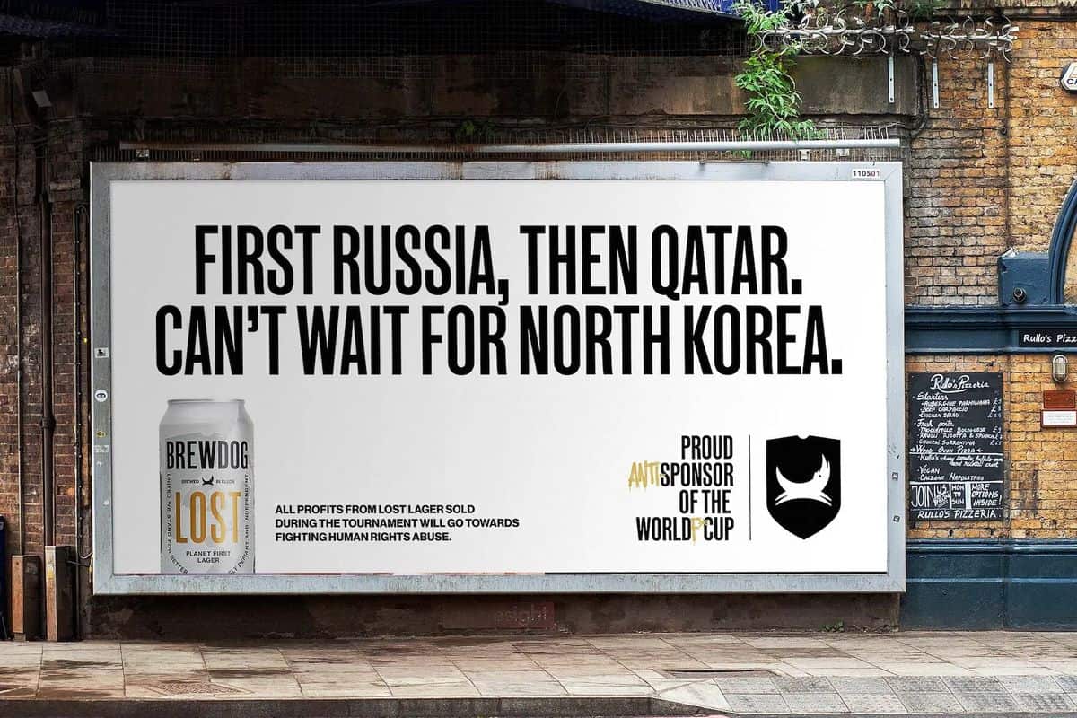
The announcements made on social media received a lot of backlash, with Brewdog being accused of hypocrisy, with Brewdog defending their decision to show the games as they don’t want to stop people from watching the football.
And it isn’t just companies who have been on the receiving end of public and moral outrage. Having previously campaigned for the World Cup in 2022 to be hosted in England and Wales, former footballer David Beckham has taken up a lucrative role as an ambassador for the Qatar World Cup.
Comedian Joe Lycett responded to this with a very public publicity stunt pleading with Beckham to end his sponsorship deal with the country, promising to donate £10,000 of his own money to LGBTQIA+ charities – and if he didn’t he was going to shred the money.

David Beckham or his team didn’t respond to the request, and the comedian later appeared to shred the money – he later announced that it wasn’t real money and that he had already donated the cash to charities, but the stunt attracted the attention of millions.
In conclusion, the general consensus is that this doesn’t feel like a normal World Cup, and this has been reflected in user search behaviour and the uncertainty from brands about what stance to take, which has taken gloss away from the big event.
But Google has already highlighted the global interest in the tournament, with it already being the most searched World Cup in history just less than a week in.
Despite the controversies that preceded the World Cup and its hosts, the quadrennial tournament is always going to generate huge interest, and as Google and the internet evolve there are always going to be new opportunities to offer something new to the user.

by Dylan | Feb 25, 2022 | SEO
As part of the ever-evolving digital world, search engines are always trying to find new ways of feeding users with creative ways of displaying information.
Quickly digestible and often presented in an attractive way, Featured Snippets are an effective way to grab the searchers (often short) attention with concise definitions, step-by-step instructions, tables and lists.
Position #0
Due to its ability to sit in a league of its own, and impressively, above organic rankings, featured snippets are often referred to as ‘Position #0’. As a result of this, this directs taps into the click-through rate from the search term.
A study by Ahrefs found that the top-ranking result of an average search term had 26% CTR, whereas a search term that had a featured snippet claimed 8.6% of traffic with the top search term claiming 19.6%.
This turns the featured snippet into something of a magic bullet, discounting all of the traditional SEO rules and practices to get ahead of the rest.
But it can also act as a useful tool for someone who is quickly looking for an answer and might not necessarily have to click on anything to get what they are looking for.
The versatility of the snippet itself can result in a no-click search, where all the information is quick and easy to follow, and depending on the complexity of the answer this can be answered in a short concise paragraph, a step-by-step guide a diagram.
Because of this, the snippet may have in appearing in Position #0 this may inform a wider keyword strategy, as this might divert what normally would be the organic traffic that is placing high up the rankings away from you.
The Main Types of Snippets
To help optimise your snippet for the search term, there are different types that Google and other search engines use. This means that you will have to identify the best way to format your snippet in order to have it feature.
The Paragraph
Using a brief and concise description, definition and other information on a topic, the paragraph snippet is a useful answer to queries.
Of all featured snippets on Google, paragraph snippets account for around 70% of all of these, as they can be quickly digested when the search is clear and direct.
As well as using the paragraph to answer specific questions, they can also be used as a definition box, where it can give the basic meaning of something. This allows the user to then decide if they have got enough information, or if they want to read on.
The Table
A useful way of visualising data when making comparisons. The ultimate goal for the user is to be able to spot large gaps and differences.
The table snippet is especially useful when you are comparing clothes or products sizing, comparing big and small data and as another way of displaying a list, which leads us nicely onto the next type of featured snippet.
Lists
Lists are a great way to quickly solve a question or give instructions. The key to it is understanding what the searcher is expecting to see before optimising the format in the most attractive and user-friendly way possible.
Useful in different ways, they can also vary in their appearance. There are numbered lists, which lend themselves to step-by-step instructions extremely well. There are also bulleted lists that don’t have to follow such a rigid structure.
Videos
With YouTube becoming one of Google’s subsidiaries in 2006, videos are a great way to weave a snippet in.
These are usually used as a how-to query, where it is easier to demonstrate the steps visually rather than as part of a list.
Looks Like a Snippet… But Isn’t a Snippet
As time goes by Google always likes to treat us to new flashy new ways of showing off their capabilities. These fall under special content resource blocks.
Rich Answers
These are instant answers that Google have preloaded without having to give credit to other websites.
Knowledge Graph
Pulling different answers sometimes from a variety of different sources, appearing in a neat box with accompanying images, and in the example’s case, secondary information that compares the individual tiles.
When navigating through the carousel of images, you are able to click into each one, which opens up wider links. These are usually used when searching for landmarks, brands, people and organisations.
Rich Snippets
Slightly different to other snippets, Rich Snippets use a range of different features compared to others, where the format is more fixed. These are created by the search engine by reading code, using it to create rich results.
The extra information embedded within them enhance the detail, giving it its title by making it a richer result. Recipes are usually a good example of a rich snippet, as the pancake recipes have the ingredients, prep time and ratings, which gives you a lot to take in.
How Do You Get a Featured Snippet?
Unfortunately, it isn’t as simple as sending a message to the good people at search engines asking for them to use a pre-designed snippet.
However, the good news is that as a form of organic content, the featured snippet box is available to anyone who knows how to optimise their content well.
Answer Questions
With the majority of snippets informational in their nature, your content should be created to answer questions. In-depth content indexed by Google’s crawlers that gives the best answer can take the content to use in the form of a featured snippet.
Get Inside the Mind of the Searcher
SEMRush and Brado studied over 160 million keywords on desktop, as well as 46.1 million keywords on mobile, and it found that questions are an especially rich land for Featured Snippets.
29% of all queries that trigger snippets start with question-based words like “why”, “do” and “how”. Within this, 77.6% of all queries that start with “why” return featured snippets.
With this in mind, you can draw up a list of questions that you think your content could accurately answer. This involves research into the search itself, giving you a better chance of getting the snippet if there isn’t one currently.
If you are in need of inspiration on what sorts of questions people are asking, simply start searching a question in your search bar and let Google’s suggested search bar do the work for you.
There are other free resources that can help inspire your question-based keyword research, including Answer The Public.
Polish Your Content
The best way to think about achieving a featured snippet is that it is a reward for having truly high-quality content.
Just imagine it as if you are trying to rank something in an organic way, but instead, there are also sub-targets within it to answer the specific questions.
This goes for all content that you want to rank, but try and make sure your content is high quality, comprehensive, entertaining and engaging and user-focused.
Take a Deep Dive
What better way to show off how much of an authority you are in a subject than to take a deep dive into it, demonstrating what a pillar of knowledge you are on it.
This means that you can’t expect to achieve a featured snippet if you only touch the surface with your content.
Ways of achieving this include:
- Cover every question that could come up from this topic.
- Vary your content – from videos to step-by-step infographics and screenshots.
- Try and tailor the content for beginners, no matter what it is.
Always have an eye on the competition, if you are often left scratching your head wondering how some content is ranking highly that is a good sign. It shows that you have identified that you can create something better.
Use Q&A’s
Q: Why is it a good idea to have a Q&A section on your page?
A: Because it is a great way to display all relevant questions with a pre-formatted answer oven-ready for featured snippets
Q: Great, so does this mean that they can replace the content?
A: No, they should consolidate the information already on the page. When creating this section, imagine it as it being a conversation where you are giving a concise answer.
Q: When you say concise, how much does that mean?
A: The ideal answer should be somewhere between a short answer that doesn’t give much away and a long-winded one that waffles on too much. This can be in effect roughly how you want your snippet to appear.
Featured Snippets The Future?
As search engines become more advanced, with a continual focus on user intent and experience, they will carry on gaining importance, becoming even more of a feature of a searchers life.
What we might not be able to predict is what form they will take. As the web develops, user and search engine trends start to shift. This could open the door up for even more ways of displaying information through a snippet in years to come.
Whatever happens though, one thing that we can be sure of is that by following the best practices in optimisation now, it will always keep you in a strong position. Content that is designed for people to consume in the most efficient and effective way possible is something that will always be key in making you an authority in a crowded digital world.

by Dylan | Oct 22, 2021 | Design and Branding
For the past five years, the UK has seen a sharp growth in the number of breweries. In 2020 the number of breweries in the country went up by 216, with the total now standing at 3,018.
This got us thinking, will this continue to grow to a point where established brands dip into the market to keep the thirsty country afloat?
What would they look like? How would they taste? Who would buy them?
Well we have had a go at predicting the future, designing our own beers for various different companies who might even one day try creating their own.

by Dylan | Oct 12, 2021 | Design and Branding
Fantastic Image Formats and Where to Use Them
Picture the scene, you’ve just created an amazing design that you are proud of. Every single pixel has been rigorously checked and now it is time to share your genius creation with the world. But there is just one last hurdle to jump – get this wrong and it could prove to be costly!
In this article, we will explore all of the amazing image formats there are, helping you to navigate the maze and prevent you from falling into any hidden formatting traps, as well as offering hints and tips to help you find the perfect fit.
PNG vs JPEG
Before you embark on any design project the first thing that you need to identify is what is its purpose? This will ultimately decide how you are going to save the file.
Each format has its own benefits, and as a piece of communication, the format acts as the technical backup that your file needs.
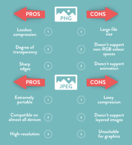
PNG
Let’s start with Portable Network Graphics, aka PNG files. The format was designed to be used on raster graphics, screenshots and on logos. Because of this, the file size is large – a lot more so than JPEGs.
As a result of being so large, a PNG file supports lost compression. This means that it is extremely versatile, looking sharp and clear on a wide range of different ratios, from large main website images to thumbnails.
Providing great depth in colour ratios, PNG is especially useful when your design has areas of transparency. The alpha channel that the format uses will allow you to have partial to full transparency, which makes it useful for creating fades.
JPEG
On the other hand, you don’t get as much versatility with JPEGs as you do with PNG’s. When you compress JPEGs this will alter the quality of the image or design. The file size is also a lot smaller, and because of this, you are unable to have transparency.
Despite its limitations, JPEG does have some benefits. It is the most common graphic format for photographs as it is able to display the same level of detail as a PNG at a fraction of the file size.
Due to being such a small file, this can also benefit when used on websites, as it will keep loading times low to improve someone’s experience on them.
Any Other Formats
When you hear the word GIF you immediately think of looping jolty videos of cats falling off tables. But they are also an effective and surprisingly easy format to create interactive designs.
A Graphics Interchange Format, aka GIF, supports multi-page formats, as well as transparency. This means that you can use the format as a more interesting way of displaying information.
You can use it to deliver messages in multiple parts, display different products a company sells with their prices and even create your own animations on it. This simple yet effective format can be a lot more powerful than just a still design.
Another format that is extremely useful when creating designs – especially on logos and text graphics is a Scalable Vector Graphic, aka SVG.
This is because an SVG is an image that can be searched, indexed, scripted and compressed. Most importantly it can be scaled in size without losing any quality.
Because of this, it is always useful to have a library full of SVGs that you repeatedly use in designs. This means that no matter what the file size of the design is, the SVG will always look crisp and not distorted.
Image Sizing Matters
The size of an image or design affects a lot of areas, some of which you might not be aware of.
Images that are optimised for the web generally fare a lot better than those that aren’t. There are three main reasons for this:
- They look good on the page.
- They load a lot quicker than those that aren’t optimized.
- They are easier for search engines to index – resulting in stronger SEO.
And it is really simple how to optimize an image for a website – ensure that the sizing of it is web-friendly.
The higher the resolution of an image, the larger the file will be. If you were to print off this image it would be recommended to go higher with the resolution.
However, on the web, it is a different story as this will slow the web page down significantly. This hurts user experience on both desktops and mobiles.
But just how do you strike the right balance between size and quality?
Let’s start with how much a file actually takes up. The more bytes that a file has the more likely it is to slow down a website. Images that are over 5MB are quite large files, whereas anything displayed in KB is more reasonable.
There are different causes for large files. This could be because the image dimensions are too large, the resolution is too high or because of the complexity of the design or image.
One quick and easy fix is to just make sure that your dimensions are not too big. The typical image on a website is 795×300 pixels, which might not seem too much, but you are still able to get the detail needed to communicate.
And when it comes to the resolution, this is measured in dots per inch. Printers sometimes require images to be printed in 300dpi, but this level isn’t required in computer monitors. Most of them are set at 72dpi or 92dpi, which means that anything larger than that is unnecessarily large, without being beneficial.
Most editing software has shortcuts that can help you bypass this. When saving a post, there is a save for web option, and this automatically saves an image at a lower dpi.
One final tip for when uploading an image to a CMS is to always name it something appropriate. A Google index crawler is more likely to understand an image with an appropriate name to what it is than to one with a default name, usually one that consists of numbers and random letters.
Getting the Right Dimensions
Social Media
With this information on how to save an image for the web that is optimized, you can now explore other ways to get creative with the design.
The dimensions of a design will always be influenced by its purpose and destination.
When posting a design on social media, especially on Instagram it is worth noting how it will appear on a phone screen. Instagram itself has a preset square template, so by ensuring that your dimensions are equal, the design will fill them perfectly.
Instagram compresses an image to 600 x 600, but if you save your design as a PNG that is 1080 x 1080 your design will look flawless without any resolution being affected.
This is similar for other social media platforms, but the key thing to remember is that despite compressing your designs, the finished product will still look detailed. This will mean that any resolution around 1000x will look sharp and attractive.
Banners for Ads
Banners come in all different shapes and sizes. Because of this, they all have their own advantages in how you can communicate with them.
Some banners will allow you to pack it full of interesting images, design and copy, whereas some have less space, but can equally be as memorable and punchy.
With Google Ads, there is a range of common dimensions used that can fit into one of four categories:
- Squares
- Rectangles
- Skyscrapers
- Leaderboard
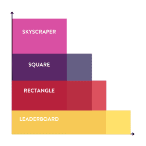
The most commonly used square size is 250 x 250, but you can also use a small square, which is 200 x 200.
With rectangles, there is a similar variation in that the most common is 336 x 280, but you can also have smaller ones, with 300 x 250 another size that is regularly used.
The benefit of using squares and rectangles is that you will find that there is a lot more space to express design. The shape of the surface area allows you to use different features and stylistic techniques.
Alternatively, skyscrapers and leaderboards are slightly different, as they have a more stretched surface area.
Named after their resemblance to the city skyline, the most common skyscraper is 120 x 600. Leaderboards are the opposite, they are wider than they are tall, with 728 x 90 being a go-to size.
Due to its shape, leaderboard designs are much more compatible with copy, as you will be able to fit a sentence naturally. This would be harder to do with a skyscraper, but equally as effective and you can clearly put all the important information in divided sections.
In terms of the actual design, it is worth noting that because of the size the image is going to appear at, the text has to be large and clear. Short, snappy straplines and keywords are important here as you are trying to grab people’s attention. By accompanying this with a call to action button, the headline keyword will act as a hook for the audience to “Find Out More”.
One final thing that is worth noting is that Google is extremely good at compressing image files without a decrease in the quality of resolution.
This means that you will be able to create your templates in a larger size to improve resolution, as long as they can be compressed into the file size requirements.
For example, a square template with a Google Ad size of 250 x 250 can be designed at 500 x 500, 1000 x 1000 or even 2000 x 2000. By saving as a PNG, this will mean you will have the same glossy design.
Conclusions
So what have we learnt from this scratching of the surface into the complex world of design? First of all, it is a minefield. But it is one that we can stop and think about before we set.
Every design format has a purpose, and you should observe these to tailor your design to its overall purpose.
The simple steps and considerations that you have to take might not seem like much, but the result of them will be incredibly effective.

by Dylan | Jul 5, 2021 | Design and Branding
Whether you are just starting your business out, or are an established name in your field, the logo is the first thing that you want the world to see and understand about your company. As a result of this, you want it to grab attention, make a strong impression and form the foundations of your brand identity.
Creating a new logo is not just something you can quickly knock together in a matter of hours. A wide range of factors will influence your decisions, helping to steer your creative vision.
1. Understanding the Brand.
Before you even open up your design software, it is important to lay the groundwork in the form of base company research. Whether you are acting on behalf of a client for a company you are not so familiar with, or as part of an internal design team, you need to understand the company from top to bottom.
To build a bigger picture, ask these questions and answer them in as much detail as possible:
- What makes you different from your competitors?
Another way to understand your business is to identify your customer base. Create a mood board, creating a comprehensive understanding of who your customers are. What other sort of brands would they be loyal to? What are the visuals and designs that they are attracted to?
Although this won’t magically solve what your logo will look like, it will help you understand what you are trying to achieve, and also importantly, what sort of designs you would be trying to avoid.
2. Research the Field
Naturally, when you start to create your logo, you want to stand out from the crowd. This shouldn’t stop you from checking out what the competitors are doing with their logos, branding and identity.
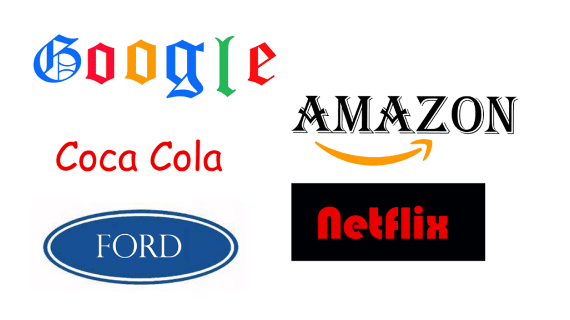
For example, if you are tasked with creating a new brand for a barbershop in Leeds, create a logo board displaying logos side by side.
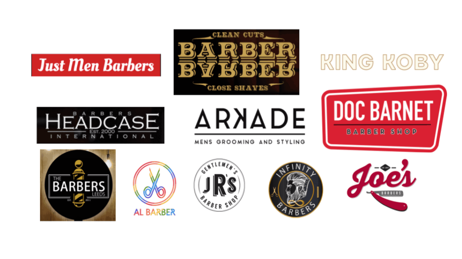
Having a range of logos on a sheet will help you to notice similarities and differences in the way that brands use text, font, colour and icons, as well as noticing certain layouts.
From a design perspective, you can then draw inspiration from the ones that you think work well, whilst also informing you on what to avoid.
It is worth remembering that the idea isn’t to reinvent the wheel. Most ideas have been tried and tested before, so there are rules and conventions in every industry that can be followed.
3. The Design Considerations
After researching your competitors, as well as getting a good understanding of the company whose logo you are creating you will be at a stage where it is finally time to start your design.
Every designer has their own process. Whether that be picking up a pencil and sketching some conceptual ideas or diving straight in, whatever works best for you.
Within this though, there are certain considerations and factors to observe.
One of the most important ways to set the tone for the logo is through the font and typography. Is the font used appropriate for the logo? From your research on other competition, you would be able to see exactly what styles similar businesses go for, whilst also seeing what would be wildly inappropriate.
Can you combine typography with icons? Some of the best logos are layered in a way that have icons embedded within them that have a meaning or are they of significance. This is something you can get creative with. Does your company have any objects that are synonymous with the service? For example, could a hair salon use any letters to create a pair of scissors?
You may have set company colours that you are planning to use for your logo already, but it is worth thinking a little bit about this before you make your final decision.
To understand what colours might be best used together, you can use the colour wheel to help inform your decision-making process.
Marketers use techniques to create colour harmonies by simply referring to the colour wheel.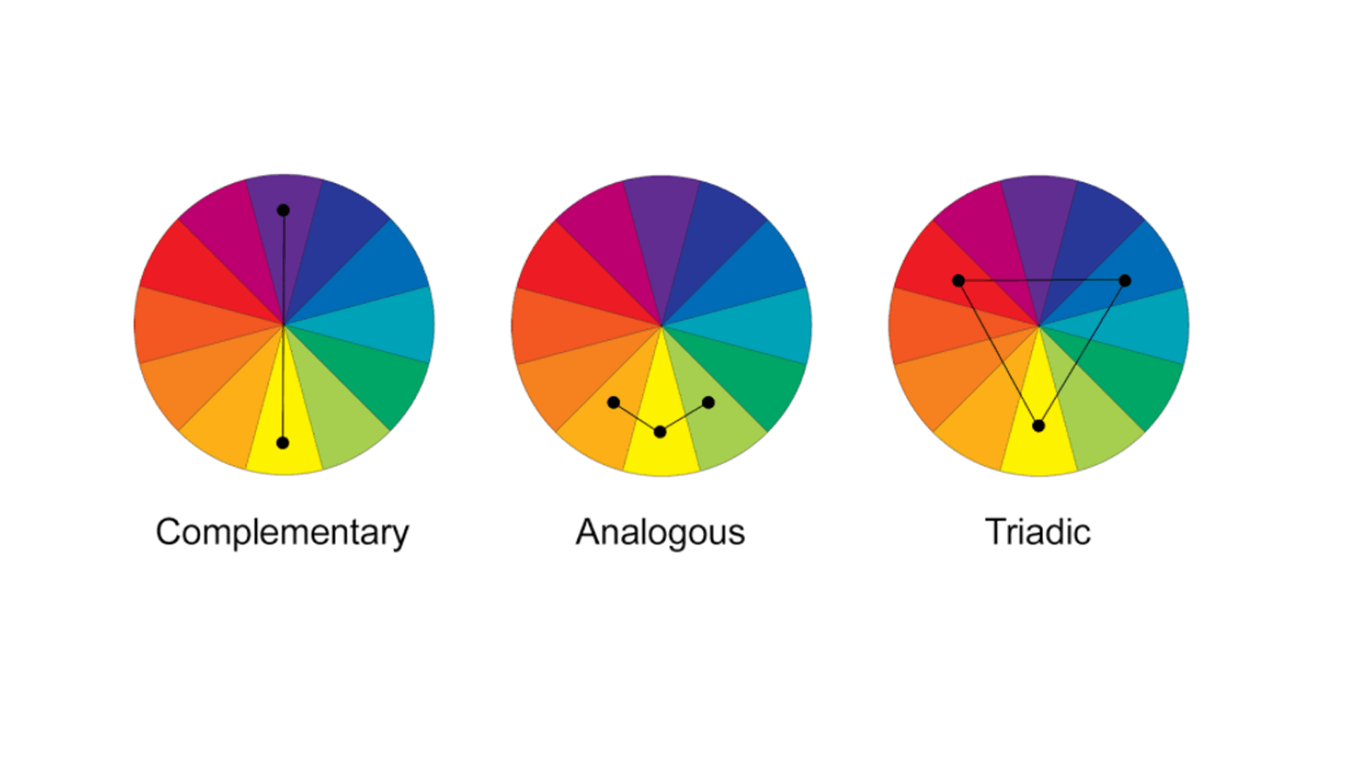
Colours at the opposite end of the wheel will naturally complement each other, but other relationships like Analogous colours, where they sit next to each other on the wheel can also be used to create pleasing harmonies.
Using the image above, try out the different techniques on your own design.
4. The Social Media Test
You have got to the stage where you are fairly comfortable that you are pleased with the logo. The design is pleasing, there is the right level of text and iconography on there and you can’t wait to show it off to the world.
However, there is one more consideration to take. How will it look on social media profiles?
When someone is scrolling through Twitter or Facebook on a mobile screen, they are only going to see a tiny logo in the corner of the screen.
Is this going to be instantly recognisable and memorable? This can be done through using the colours wisely, a hierarchy of elements on the logo so something stands out, or by the layout or shape of it.
A good way to think of it is how would it look as a widget for an app? If you can create an icon or letter that is instantly recognisable, like the Facebook app logo, when seen repeatedly the consumer will know instantly what the logo stands for.


")


