
by Dylan | Oct 12, 2021 | Design and Branding
Fantastic Image Formats and Where to Use Them
Picture the scene, you’ve just created an amazing design that you are proud of. Every single pixel has been rigorously checked and now it is time to share your genius creation with the world. But there is just one last hurdle to jump – get this wrong and it could prove to be costly!
In this article, we will explore all of the amazing image formats there are, helping you to navigate the maze and prevent you from falling into any hidden formatting traps, as well as offering hints and tips to help you find the perfect fit.
PNG vs JPEG
Before you embark on any design project the first thing that you need to identify is what is its purpose? This will ultimately decide how you are going to save the file.
Each format has its own benefits, and as a piece of communication, the format acts as the technical backup that your file needs.
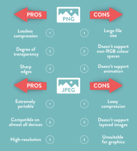
PNG
Let’s start with Portable Network Graphics, aka PNG files. The format was designed to be used on raster graphics, screenshots and on logos. Because of this, the file size is large – a lot more so than JPEGs.
As a result of being so large, a PNG file supports lost compression. This means that it is extremely versatile, looking sharp and clear on a wide range of different ratios, from large main website images to thumbnails.
Providing great depth in colour ratios, PNG is especially useful when your design has areas of transparency. The alpha channel that the format uses will allow you to have partial to full transparency, which makes it useful for creating fades.
JPEG
On the other hand, you don’t get as much versatility with JPEGs as you do with PNG’s. When you compress JPEGs this will alter the quality of the image or design. The file size is also a lot smaller, and because of this, you are unable to have transparency.
Despite its limitations, JPEG does have some benefits. It is the most common graphic format for photographs as it is able to display the same level of detail as a PNG at a fraction of the file size.
Due to being such a small file, this can also benefit when used on websites, as it will keep loading times low to improve someone’s experience on them.
Any Other Formats
When you hear the word GIF you immediately think of looping jolty videos of cats falling off tables. But they are also an effective and surprisingly easy format to create interactive designs.
A Graphics Interchange Format, aka GIF, supports multi-page formats, as well as transparency. This means that you can use the format as a more interesting way of displaying information.
You can use it to deliver messages in multiple parts, display different products a company sells with their prices and even create your own animations on it. This simple yet effective format can be a lot more powerful than just a still design.
Another format that is extremely useful when creating designs – especially on logos and text graphics is a Scalable Vector Graphic, aka SVG.
This is because an SVG is an image that can be searched, indexed, scripted and compressed. Most importantly it can be scaled in size without losing any quality.
Because of this, it is always useful to have a library full of SVGs that you repeatedly use in designs. This means that no matter what the file size of the design is, the SVG will always look crisp and not distorted.
Image Sizing Matters
The size of an image or design affects a lot of areas, some of which you might not be aware of.
Images that are optimised for the web generally fare a lot better than those that aren’t. There are three main reasons for this:
- They look good on the page.
- They load a lot quicker than those that aren’t optimized.
- They are easier for search engines to index – resulting in stronger SEO.
And it is really simple how to optimize an image for a website – ensure that the sizing of it is web-friendly.
The higher the resolution of an image, the larger the file will be. If you were to print off this image it would be recommended to go higher with the resolution.
However, on the web, it is a different story as this will slow the web page down significantly. This hurts user experience on both desktops and mobiles.
But just how do you strike the right balance between size and quality?
Let’s start with how much a file actually takes up. The more bytes that a file has the more likely it is to slow down a website. Images that are over 5MB are quite large files, whereas anything displayed in KB is more reasonable.
There are different causes for large files. This could be because the image dimensions are too large, the resolution is too high or because of the complexity of the design or image.
One quick and easy fix is to just make sure that your dimensions are not too big. The typical image on a website is 795×300 pixels, which might not seem too much, but you are still able to get the detail needed to communicate.
And when it comes to the resolution, this is measured in dots per inch. Printers sometimes require images to be printed in 300dpi, but this level isn’t required in computer monitors. Most of them are set at 72dpi or 92dpi, which means that anything larger than that is unnecessarily large, without being beneficial.
Most editing software has shortcuts that can help you bypass this. When saving a post, there is a save for web option, and this automatically saves an image at a lower dpi.
One final tip for when uploading an image to a CMS is to always name it something appropriate. A Google index crawler is more likely to understand an image with an appropriate name to what it is than to one with a default name, usually one that consists of numbers and random letters.
Getting the Right Dimensions
Social Media
With this information on how to save an image for the web that is optimized, you can now explore other ways to get creative with the design.
The dimensions of a design will always be influenced by its purpose and destination.
When posting a design on social media, especially on Instagram it is worth noting how it will appear on a phone screen. Instagram itself has a preset square template, so by ensuring that your dimensions are equal, the design will fill them perfectly.
Instagram compresses an image to 600 x 600, but if you save your design as a PNG that is 1080 x 1080 your design will look flawless without any resolution being affected.
This is similar for other social media platforms, but the key thing to remember is that despite compressing your designs, the finished product will still look detailed. This will mean that any resolution around 1000x will look sharp and attractive.
Banners for Ads
Banners come in all different shapes and sizes. Because of this, they all have their own advantages in how you can communicate with them.
Some banners will allow you to pack it full of interesting images, design and copy, whereas some have less space, but can equally be as memorable and punchy.
With Google Ads, there is a range of common dimensions used that can fit into one of four categories:
- Squares
- Rectangles
- Skyscrapers
- Leaderboard
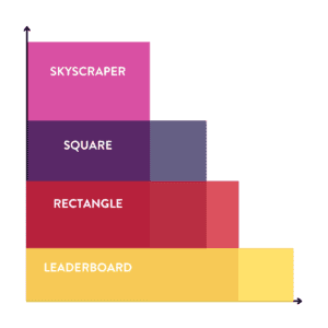
The most commonly used square size is 250 x 250, but you can also use a small square, which is 200 x 200.
With rectangles, there is a similar variation in that the most common is 336 x 280, but you can also have smaller ones, with 300 x 250 another size that is regularly used.
The benefit of using squares and rectangles is that you will find that there is a lot more space to express design. The shape of the surface area allows you to use different features and stylistic techniques.
Alternatively, skyscrapers and leaderboards are slightly different, as they have a more stretched surface area.
Named after their resemblance to the city skyline, the most common skyscraper is 120 x 600. Leaderboards are the opposite, they are wider than they are tall, with 728 x 90 being a go-to size.
Due to its shape, leaderboard designs are much more compatible with copy, as you will be able to fit a sentence naturally. This would be harder to do with a skyscraper, but equally as effective and you can clearly put all the important information in divided sections.
In terms of the actual design, it is worth noting that because of the size the image is going to appear at, the text has to be large and clear. Short, snappy straplines and keywords are important here as you are trying to grab people’s attention. By accompanying this with a call to action button, the headline keyword will act as a hook for the audience to “Find Out More”.
One final thing that is worth noting is that Google is extremely good at compressing image files without a decrease in the quality of resolution.
This means that you will be able to create your templates in a larger size to improve resolution, as long as they can be compressed into the file size requirements.
For example, a square template with a Google Ad size of 250 x 250 can be designed at 500 x 500, 1000 x 1000 or even 2000 x 2000. By saving as a PNG, this will mean you will have the same glossy design.
Conclusions
So what have we learnt from this scratching of the surface into the complex world of design? First of all, it is a minefield. But it is one that we can stop and think about before we set.
Every design format has a purpose, and you should observe these to tailor your design to its overall purpose.
The simple steps and considerations that you have to take might not seem like much, but the result of them will be incredibly effective.

by Dylan | Jul 5, 2021 | Design and Branding
Whether you are just starting your business out, or are an established name in your field, the logo is the first thing that you want the world to see and understand about your company. As a result of this, you want it to grab attention, make a strong impression and form the foundations of your brand identity.
Creating a new logo is not just something you can quickly knock together in a matter of hours. A wide range of factors will influence your decisions, helping to steer your creative vision.
1. Understanding the Brand.
Before you even open up your design software, it is important to lay the groundwork in the form of base company research. Whether you are acting on behalf of a client for a company you are not so familiar with, or as part of an internal design team, you need to understand the company from top to bottom.
To build a bigger picture, ask these questions and answer them in as much detail as possible:
- What makes you different from your competitors?
Another way to understand your business is to identify your customer base. Create a mood board, creating a comprehensive understanding of who your customers are. What other sort of brands would they be loyal to? What are the visuals and designs that they are attracted to?
Although this won’t magically solve what your logo will look like, it will help you understand what you are trying to achieve, and also importantly, what sort of designs you would be trying to avoid.
2. Research the Field
Naturally, when you start to create your logo, you want to stand out from the crowd. This shouldn’t stop you from checking out what the competitors are doing with their logos, branding and identity.
For example, if you are tasked with creating a new brand for a barbershop in Leeds, create a logo board displaying logos side by side.
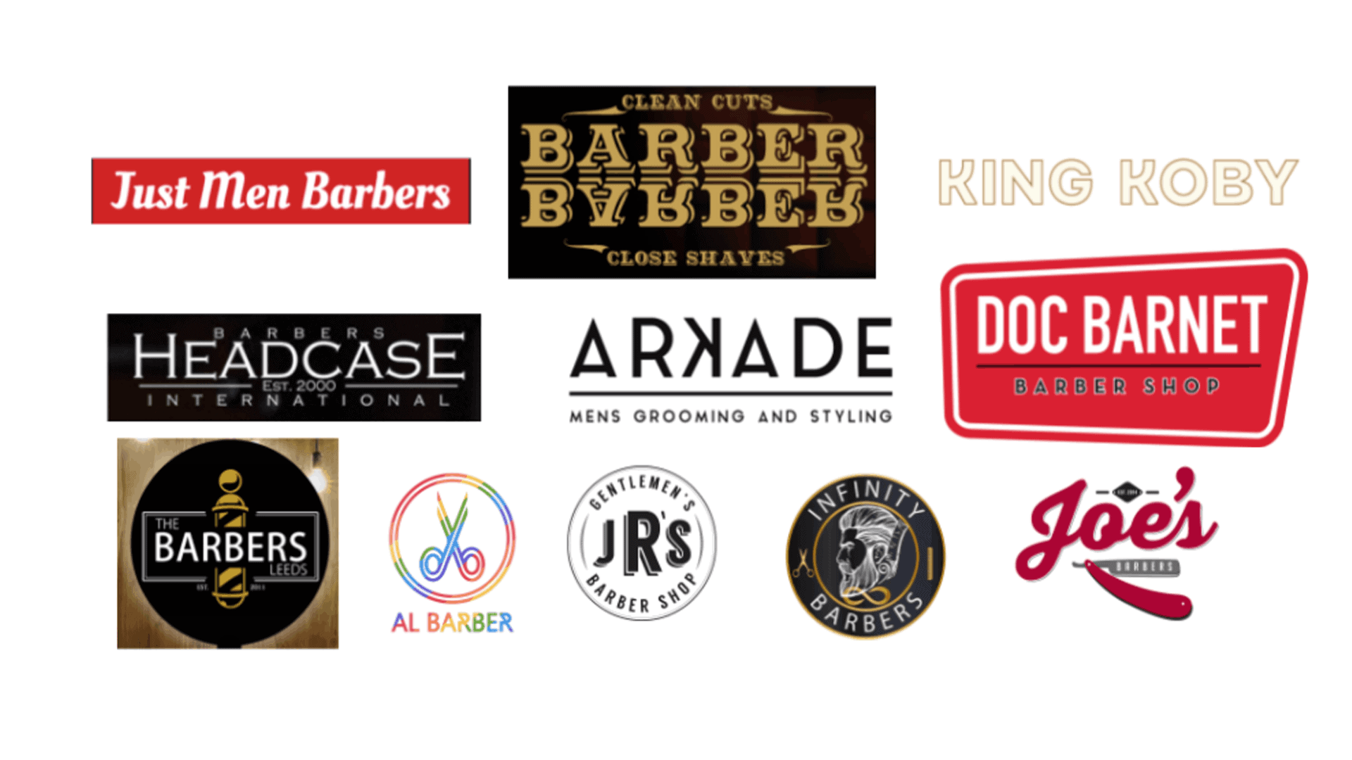
Having a range of logos on a sheet will help you to notice similarities and differences in the way that brands use text, font, colour and icons, as well as noticing certain layouts.
From a design perspective, you can then draw inspiration from the ones that you think work well, whilst also informing you on what to avoid.
It is worth remembering that the idea isn’t to reinvent the wheel. Most ideas have been tried and tested before, so there are rules and conventions in every industry that can be followed.
3. The Design Considerations
After researching your competitors, as well as getting a good understanding of the company whose logo you are creating you will be at a stage where it is finally time to start your design.
Every designer has their own process. Whether that be picking up a pencil and sketching some conceptual ideas or diving straight in, whatever works best for you.
Within this though, there are certain considerations and factors to observe.
One of the most important ways to set the tone for the logo is through the font and typography. Is the font used appropriate for the logo? From your research on other competition, you would be able to see exactly what styles similar businesses go for, whilst also seeing what would be wildly inappropriate.
Can you combine typography with icons? Some of the best logos are layered in a way that have icons embedded within them that have a meaning or are they of significance. This is something you can get creative with. Does your company have any objects that are synonymous with the service? For example, could a hair salon use any letters to create a pair of scissors?
You may have set company colours that you are planning to use for your logo already, but it is worth thinking a little bit about this before you make your final decision.
To understand what colours might be best used together, you can use the colour wheel to help inform your decision-making process.
Marketers use techniques to create colour harmonies by simply referring to the colour wheel.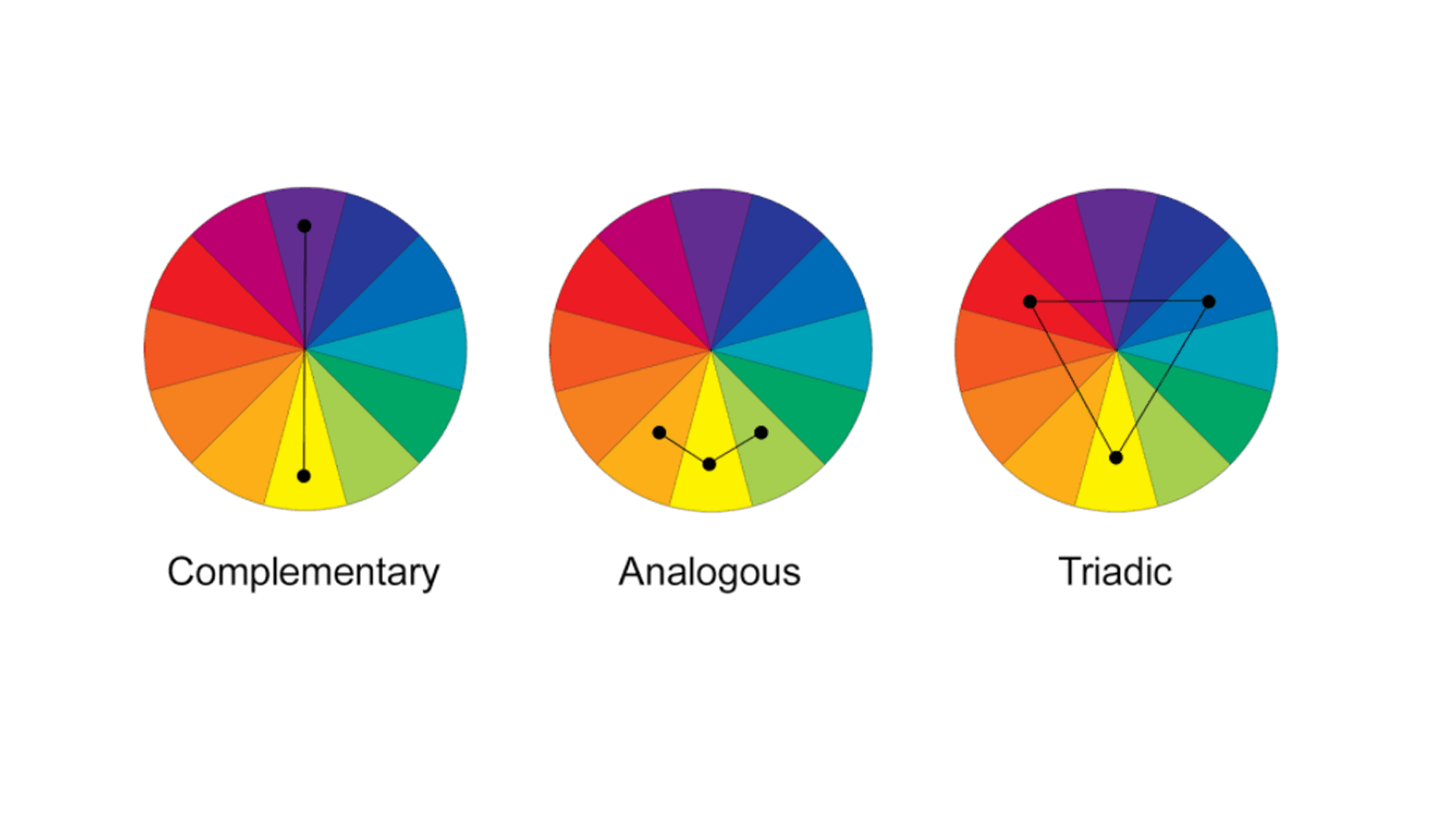
Colours at the opposite end of the wheel will naturally complement each other, but other relationships like Analogous colours, where they sit next to each other on the wheel can also be used to create pleasing harmonies.
Using the image above, try out the different techniques on your own design.
4. The Social Media Test
You have got to the stage where you are fairly comfortable that you are pleased with the logo. The design is pleasing, there is the right level of text and iconography on there and you can’t wait to show it off to the world.
However, there is one more consideration to take. How will it look on social media profiles?
When someone is scrolling through Twitter or Facebook on a mobile screen, they are only going to see a tiny logo in the corner of the screen.
Is this going to be instantly recognisable and memorable? This can be done through using the colours wisely, a hierarchy of elements on the logo so something stands out, or by the layout or shape of it.
A good way to think of it is how would it look as a widget for an app? If you can create an icon or letter that is instantly recognisable, like the Facebook app logo, when seen repeatedly the consumer will know instantly what the logo stands for.
by Robin | Mar 31, 2021 | Design and Branding
So what exactly is Brand Identity? I suppose if you asked the proverbial person in the street he/she/they might say it’s a logo or a symbol that represents a company.
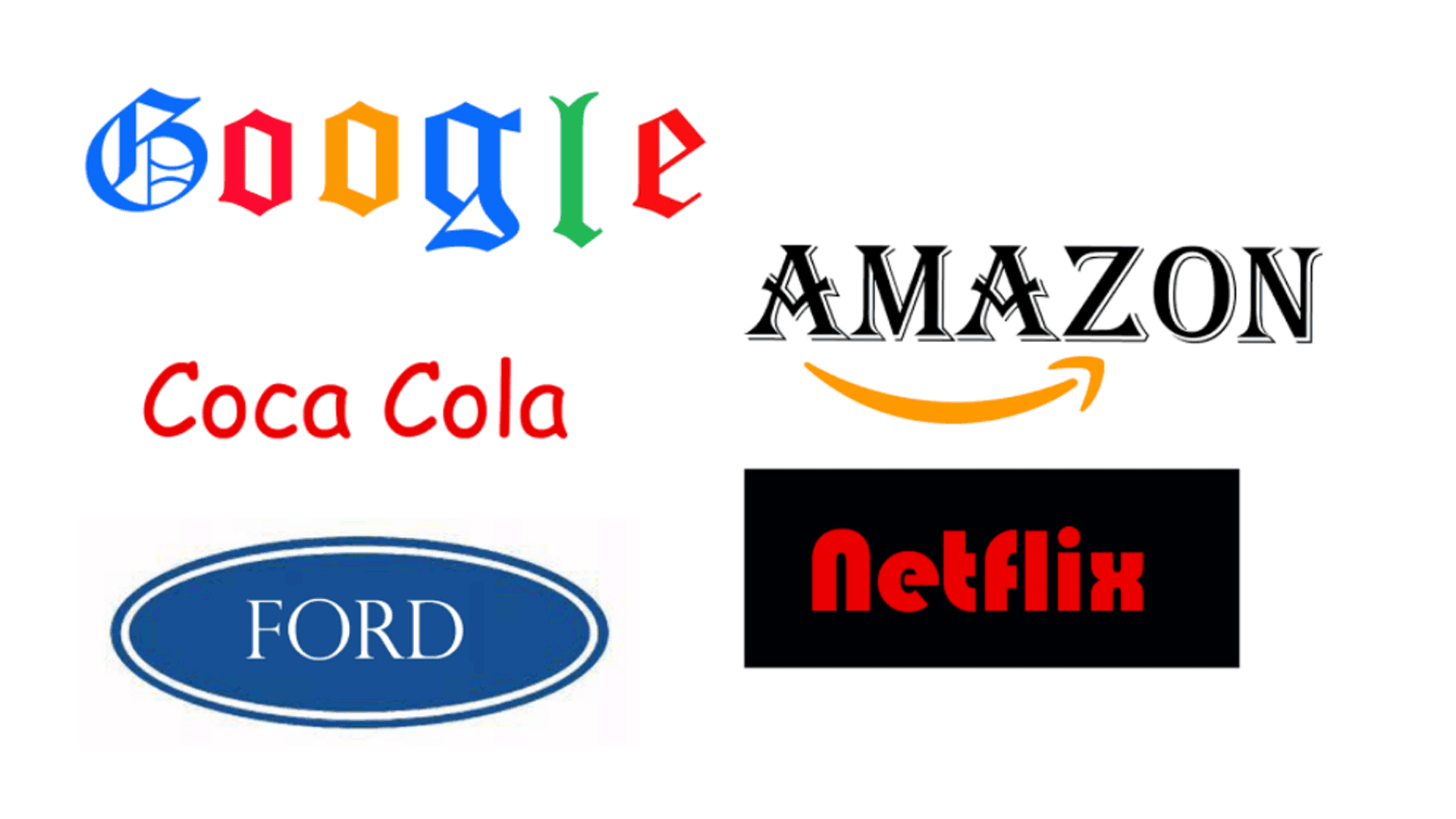
They would probably think of the most obvious examples of brands like the McDonalds golden arches or the red and white Coca-Cola can with its distinctive script. Common and obvious examples they may be but at least it demonstrates how Brand Identity affects every single one of us in our everyday lives.
Brands are all around us, big or small they determine the way we think about the services and products we use and influence our lifestyle and our purchasing decisions.
Consciously but often subliminally, we make judgements based on how we feel emotionally about the brands that surround us and that’s because they actually speak to us in a range of different ways.
Fundamental to this communication are ‘Brand Values’. These are the foundations, the DNA of any Identity project and are determined by a process of discussion and self examination. Many companies will know instinctively what their brand values are, others will be unaware that certain values underlie everything they do.
How your employees speak to your customers, how they dress, what your office or shop looks like, how motivated your staff are, how you regard your Corporate Social Responsibility (CSR) and many, many other factors will determine these values.
So say them out loud. Write them down. Don’t be modest and above all try to be absolutely honest. Typical values may be: experience; integrity; transparency; expertise; friendliness; informality – there are no rights or wrongs.
Feel free to suggest values that you may not have at the moment but to which you aspire. Think about your Brand Goals. The type of company you might like to be in the future may entail embracing new values.
Becoming aware of and framing these Values then allows us to effectively tackle the next stage of the process – The Brand Proposition.
The Brand Proposition should use the Brand Values to establish what the company feels its point of differentiation in its marketplace may be. Sometimes called the Unique Selling Point (USP) or company mission statement the proposition is the vital piece of communication that any brand will want a consumer to be aware of and to influence their thinking.
There have been many examples of how brand experts have explained this proposition. The ‘Elevator Pitch’, ‘Vision Statement’ or what you might say to your potential customers if they were in a theatre audience and you had a microphone and 30 seconds to tell them why they should pick your brand.
If you’ve done the groundwork, you should be aware of your values, know why they make you unique and why your customers should find that attractive. Then it’s on to the next stage and letting the Creatives in on the act.
We’ve established that we’re not starting to design an Identity or logo from a blank page. Using the knowledge gleaned from the process to date, an experienced designer will use the Brand Values and Brand Proposition to create a design that works, differentiating the company from its competitors.
Iconography, typography and colour choices are all vital components of the brand’s structure and should be carefully considered and implemented.
The process is a bit like having a bespoke suit made by an experienced and talented tailor. It should reflect character and personality, feel comfortable and appropriate and above all should fit the wearer so that they feel confident and reassured about how they are regarded by others.
There’s also a reasonable amount of due diligence required in terms of checking competitor activity, and making sure that (probably unintentionally) the brand doesn’t look like anyone else’s. Registering copyright with the Intellectual Property authorities should help in this process.
Someone who knows a lot about these things once said that a great Brand Identity should be “a badge you wear with pride”. So a new identity should make everyone associated with the brand feel better about themselves and confident that others will feel the same.
The story doesn’t end there however. Making sure that your new brand is “rolled out” effectively and implemented consistently so that it is always seen in its best light is vital to its success or failure. So I think that’s maybe the subject of the next Brand blog sorted.


